Mat. puts live camera cutouts on decorated mats on your iPhone home screen — used by 1700+ users on TestFlight. The redesign arranges the product like a working desk: deep green baize, butter-yellow accents, the app’s cutouts scattered as objects on the surface, and a typed letter from the maker as the closing section. Display face: Writer. One prompt. 6 sections. 21 minutes of agent time. Every save in the film hot-reloads the real WordPress page and re-runs the verification gates at 1200, 1920, and 390 px. The AGENT TIME chip shows true elapsed time through the timelapse. Six sections in twenty-one minutes — the letter section is set as a full typed page, and the mobile gate passes with the desk objects re-stacked for 390 px.

The finished page

Both frames scroll — the full page at desktop 1440 px and mobile 390 px.
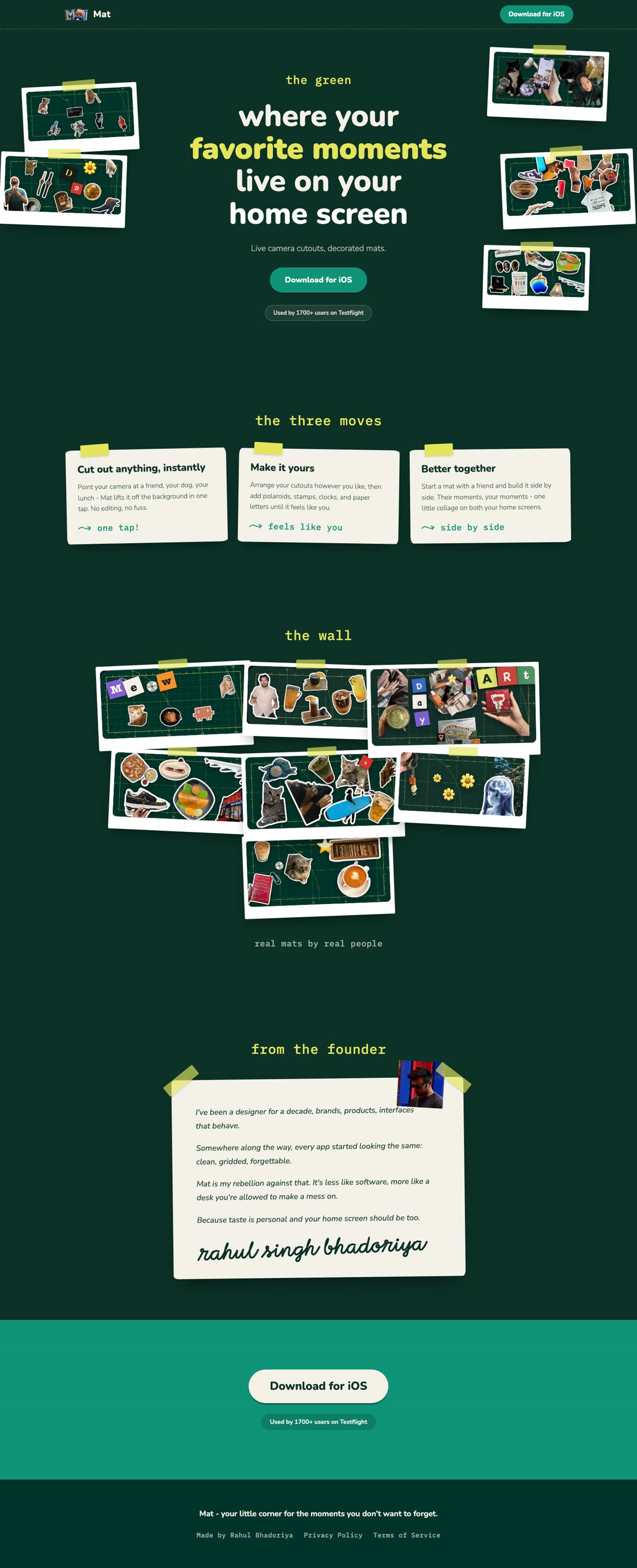

Mat. redesign — full desktop page
Mat. redesign — full mobile page

How it was built

  • The agent followed a written design brief with the section order, the design direction above, and the site’s real copy and assets staged locally.
  • exjsx dev --gates ran the loop: save → compile → deploy → hot reload → gates, a few seconds per save.
  • Sections are plain JSX components; fonts ship via one @font-face carrier (Media and fonts).
  • The finished page is native Elementor V4 — the film ends inside the editor.
A design study of the real Mat. site, rebuilt with its public copy and assets to test the toolchain. No affiliation with or endorsement by the original brand; the study is not published beyond this documentation.